Valeur [Area Conversion]
Takayoshi Ohara + Tomoyuki Yanagawa
2016
paper, acrylic plate, inkjet print
W600 x H600 x D20 mm
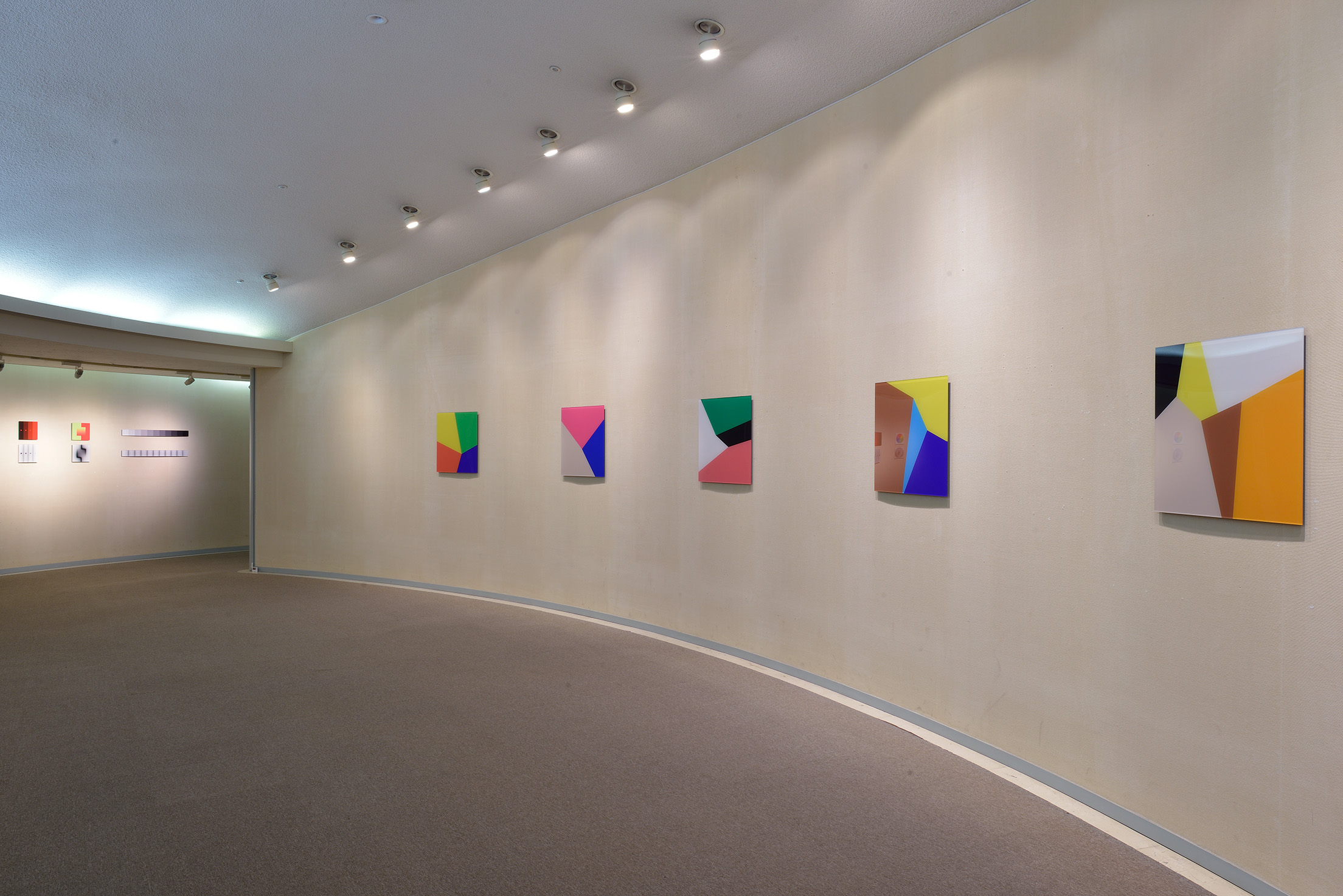
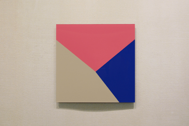
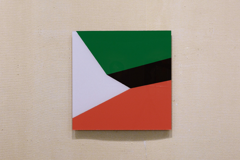
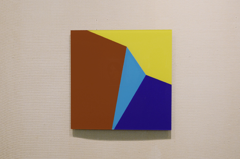
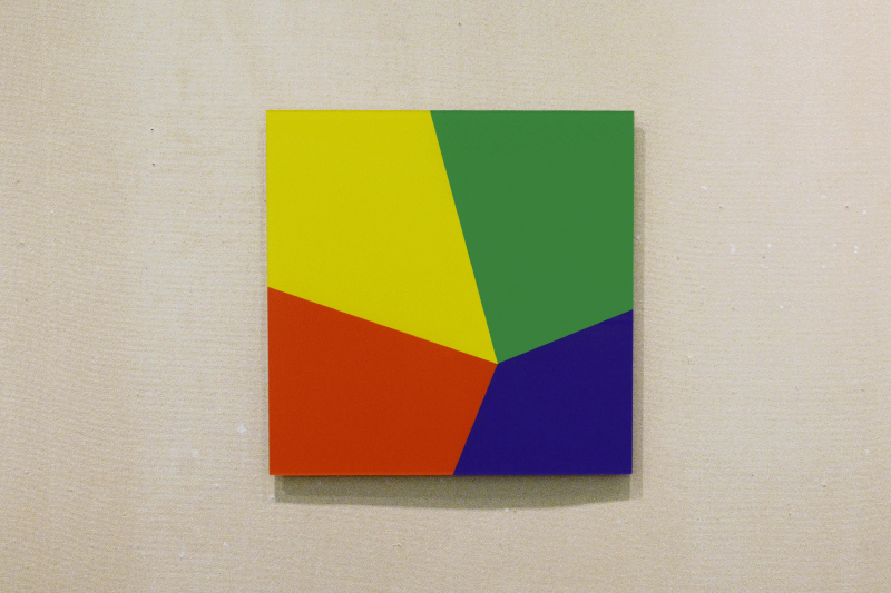
色の見えの強さはその面積や形、隣り合う色によって相対的に変化するが、《Area Conversion》では、そういった色彩と面積の関係性による造形感覚に着目した作品である。
まず任意のグリッド画像から使われている色ごとに視覚的な強さであるヴァルールを計算し、「強い色は小さく」「弱い色は大きく」といったように面積を調整していくことで、画面内のすべての色面が同じ視覚的な強さを持っているという均衡状態を作り出している。
The brightness of colours can have a relative effect on the area, shape and neighbouring colors, but in “Area Conversion”, the sense of form brought about by the relationship between color and area is explored.
Firstly, the Valeur, the visual brightness, of each color used in an arbitrary grid image is calculated, then by adjusting the area so bright colors are small, and faint colors are large, a balanced state is produced in which all colored surfaces within the image have the same visual brightness.